
Role
Product Strategy
UI Design
Interaction Design
Competitor Benchmarking
Usability Review
Tools
Figjam
Notion
Figma
Team
Graham E.
Tyler H.
Timeline
5 weeks
The Problem
After and audit of the app, my partner and I found some inconsistencies in the ways that information was displayed; lots of the cards were inconsistent and the text hierarchy differed from screen to screen.
The Solution
After doing a competitor audit and following a few different user flows on the Unplug app, we decided to create a design system that included updates to colors, type, grid, text fields, buttons, and cards.

Visual Design Review
To enhance the visual representation of meditation, we made changes to the color scheme and font of the app. We also identified 5 key cards/sections and made adjustments to ensure a consistent and cohesive experience for the user. Although our primary focus was not on the app's usability, we recognized the importance of visually conveying the app's core purpose.


Competitor Benchmarking
With the issues identified, we took a look at direct and indirect competitors to see how their user flows looked. This gave us the inspiration we needed to adjust some of the issues we identified.


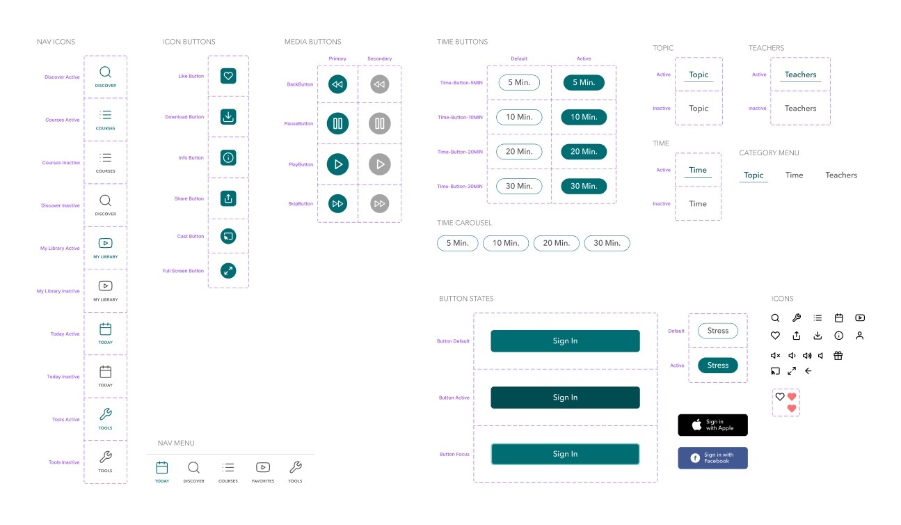
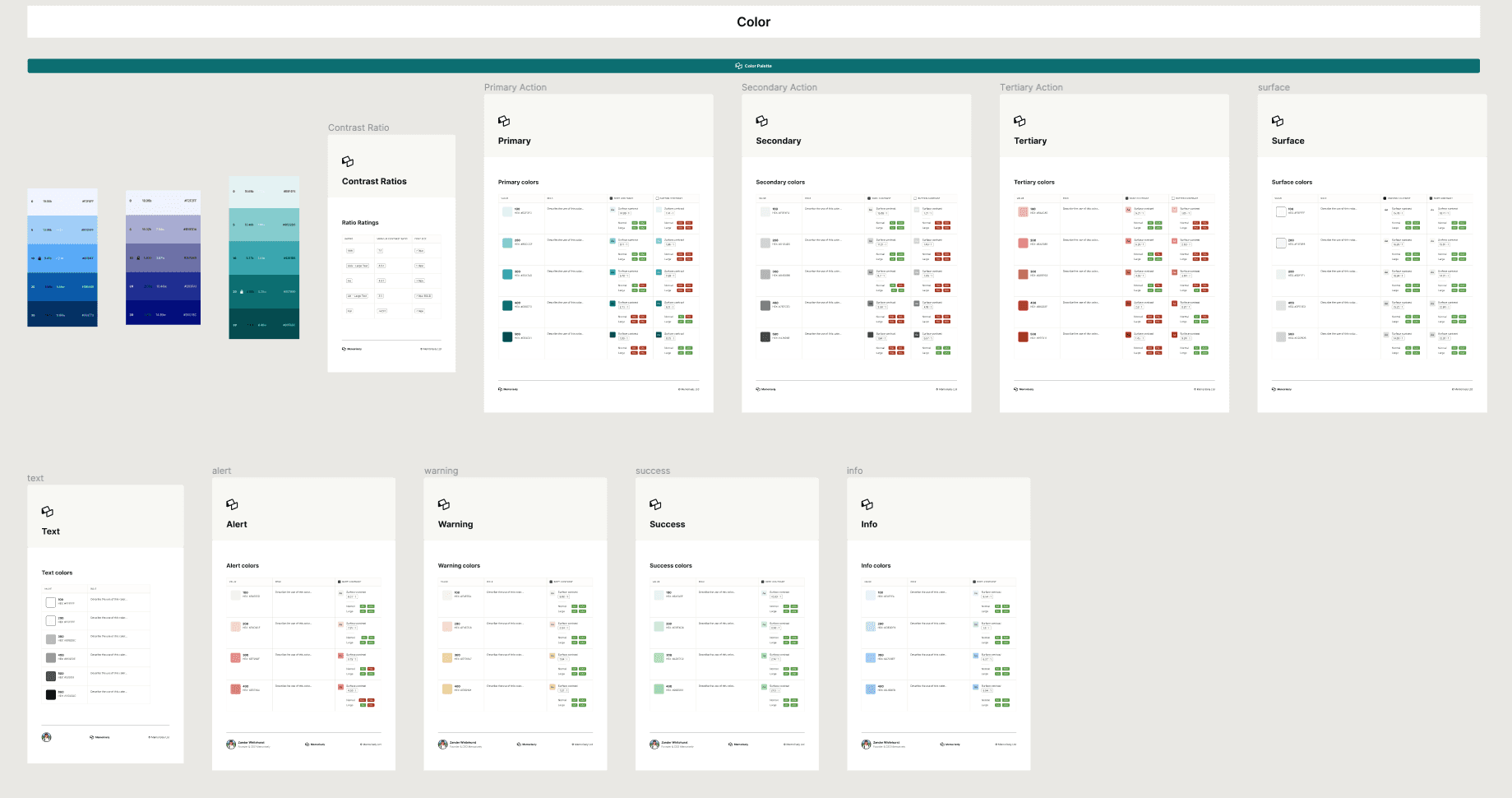
Styles & Components
We went with Avenir for our typeface. it's a clean and modern typeface that is easy to read. It was designed to be highly legible at small sizes which makes it a good choice for mobile app users.
The green color was selected as the main color for the app because it is associated with nature, tranquility growth, and relaxation — all desirable qualities for a meditation app. We also selected this color because it's a relatively uncommon color in the meditation apps we looked at — which differentiates it and makes the app stand out on its own.

High Fidelity Prototype
The final high fidelity prototype for the Unplug app includes an onboarding process that guides users from sign-up to the home screen. Once on the home screen, the recording demonstrates how to navigate through the courses tab in the navigation bar, as well as the discover tab. In the discover tab, users can sort through teachers and time options, and eventually begin a meditation. The recording provides a thorough walkthrough of the app's features and functionality.